Complete Guide to Adding Text to LINE Stickers
Text makes or breaks a sticker. Picking a readable font, adding outlines and shadows for visibility, and captioning many stickers at once.
Table of Contents
Why Text Matters on LINE Stickers
Even the same illustration becomes far more useful with a short phrase like "Thanks!" or "Got it!" added. AI-generated art is usually delivered without text, so adding it is a key finishing step.
3 Keys to Readable Text
A stylish font is worthless if it can't be read on a small chat screen. Here are the basics.
1. Choose Bold, Rounded Fonts
Thin fonts tend to blur out at sticker size. Bold, rounded sans-serif fonts are the standard choice for readability.
2. Use Outlines and Shadows
If text color is close to the background, it can disappear in dark mode or busy backgrounds. Adding a white or black outline keeps text legible on any background.
A subtle drop shadow adds depth and improves readability further.
3. Reserve Space When Splitting
Leaving room for text during illustration generation and splitting makes it much easier to balance the layout later.
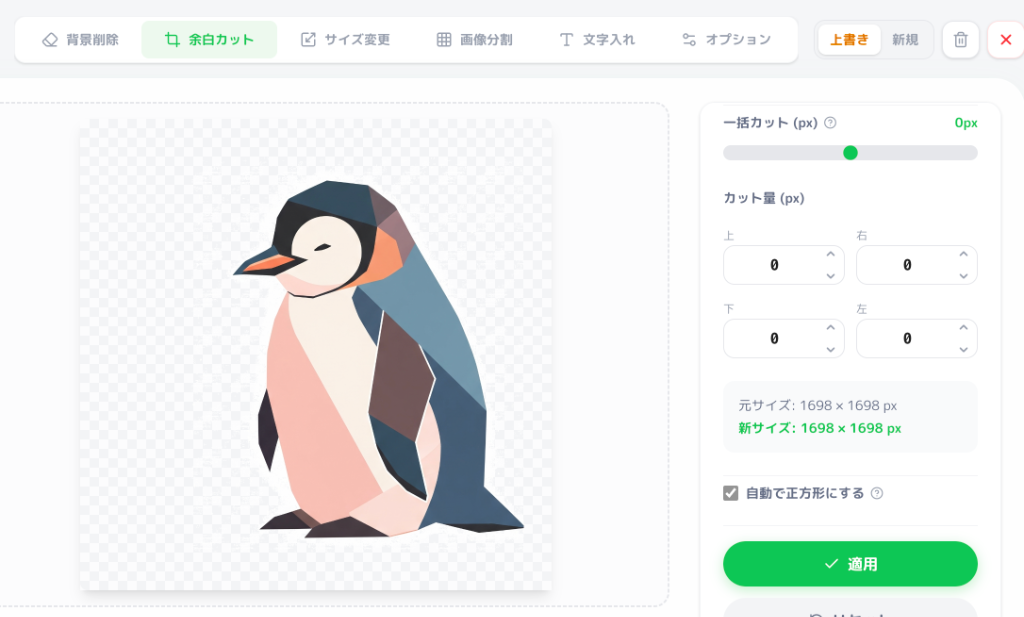
Adding Text in EzStampify
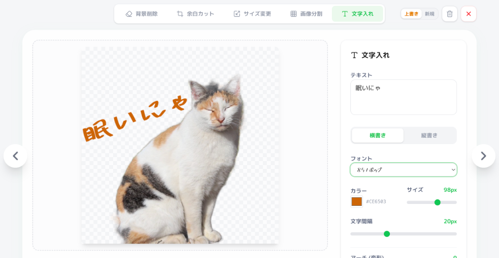
EzStampify's text tool lets you adjust font, color, and outline directly in the browser and apply it across multiple images at once.
Adding and Adjusting Text
1. Select the image and type your text with the text tool.
2. Pick a bold, rounded font from the Google Fonts library.
3. Adjust outline color/thickness and preview against different backgrounds.
4. Fine-tune position and size, then confirm.
Tips for a Whole Sticker Set
For sets full of short phrases, reuse the same font and outline style across every sticker instead of resetting each time — it keeps the whole set visually consistent.
Summary: Readability First
Prioritize weight and outline over a flashy font choice. Readable text makes your stickers genuinely useful in everyday conversation.