Background Preview for LINE Stickers: Stop 'Invisible' Art
Are your LINE stickers blending into the chat screen? Use background previews to spot hidden artifacts and stay readable on any theme.
Table of Contents
Why Your LINE Stickers Might Be 'Hard to See'
A transparent image might look perfect against a checkerboard pattern, but it behaves differently on a solid chat background. Before submitting your set, you must test it against various colors to avoid creating a 'hard-to-see' sticker.
1. Background Blending (Camouflage Effect)
Stickers are displayed directly over the recipient's chat theme. If a dark-haired character is shown in Dark Mode, it will disappear. Similarly, white clothing can vanish in Light Mode. Previewing helps you catch these visibility issues early.
2. Revealing Hidden 'Transparency Leaks'
Especially with AI-generated art or photos, tiny 'speckles' of un-erased background often remain around the subject. These artifacts are invisible on a transparent grid but stand out as messy noise when a solid background is applied. Previewing is your final 'debug' step.
The 3 Critical Colors to Check for Maximum Visibility
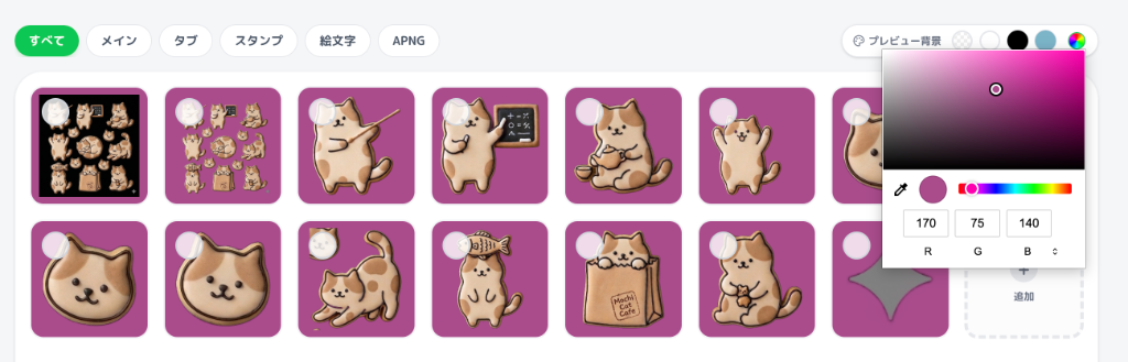
Use EzStampify's 'Background Preview' (the palette icon) to toggle through these three essential themes:
• White (Light Mode): Highlights dark artifacts, un-erased shadows, and dirty edges. It also helps you see if light-colored characters lose their silhouette.
• Black (Dark Mode): Testing for Dark Mode is now essential. Check if dark hair, navy clothing, or shadows blend into the void. Look for 'jagged' or white-fringed edges.
• Blue/Green (Classic Defaults): Test your sticker's overall 'pop' against the standard colors most users see every day.
If the silhouette of your sticker is clearly recognizable on all three, it will be easy to use for everyone.
The Ultimate Fix: Adding a White Outline
If your preview reveals that the sticker blends too much into certain colors, adding a 'white outline' is the professional solution. Here’s how to do it efficiently:
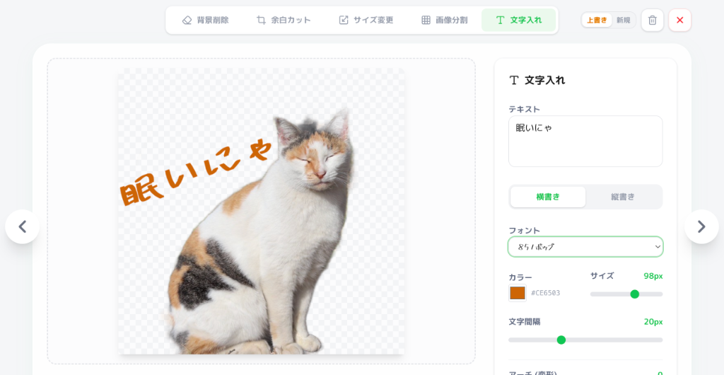
1. For Text: Use EzStampify's Outline Feature
When adding text with our built-in tool, always apply a 2-4px outline (stroke). This ensures your text remains readable regardless of the chat background. High-visibility text is a core requirement for a successful sticker set.
2. For Illustrations: Include Borders in Your AI Prompt
The smartest way to get a clean border is to include keywords like 'white border', 'thick outline', or 'sticker style' in your AI image generation prompt. Generating with an outline from the start makes background removal much easier and gives your stickers a polished, professional 'sticker' look.
*Note: For existing images without borders, you'll need to manually add them using a paint app like ibis Paint before importing.
Final Check: Preserving Transparency & Quality
Even a perfectly previewed image will fail if you save it incorrectly, turning it into a boxy 'hard-to-see' image with a white background. Always export as PNG to keep your alpha channel intact.
Note: Smartphone gallery apps often display transparent PNGs with a solid white background—this is just a display setting. As long as EzStampify's preview shows the background colors correctly, your file's transparency is safe.
Tip: Set the preview background to 'Black' and look closely for any 'white haze' or stray pixels before you hit download. A clean preview leads to a high-quality, professional LINE sticker.